Overview
-

Problem
FITT Meals was spending heavily across marketing but users weren't converting. I analyzed the data and found out that the biggest drop off was right before checkout. I started working on the revamp of the ordering journey.
-

Central Question
How might we redesign the meal-plan journey so it's easy to navigate, easy to convert on, and intuitive enough that a first-time visitor understands exactly what they're getting, and what it costs, before they're ever asked to create an account?
-

Result
I rebuilt the journey around three changes: show the full price upfront, guide people with presets instead of manual customization, and let them pause, skip, or swap on their own. After launch, conversion rose 146% and bounce rate fell from 28% to 7%.
The full story
FITT Meals was doing well, but not nearly as well as it wanted to. Users kept dropping off before placing an order and nobody could say why. The paid media budget was very high and the results weren't coming in. With an ambitious goal of 2,500 customers this year, the numbers said we would miss it, so I started by finding out where and why people were leaving.
Legacy app
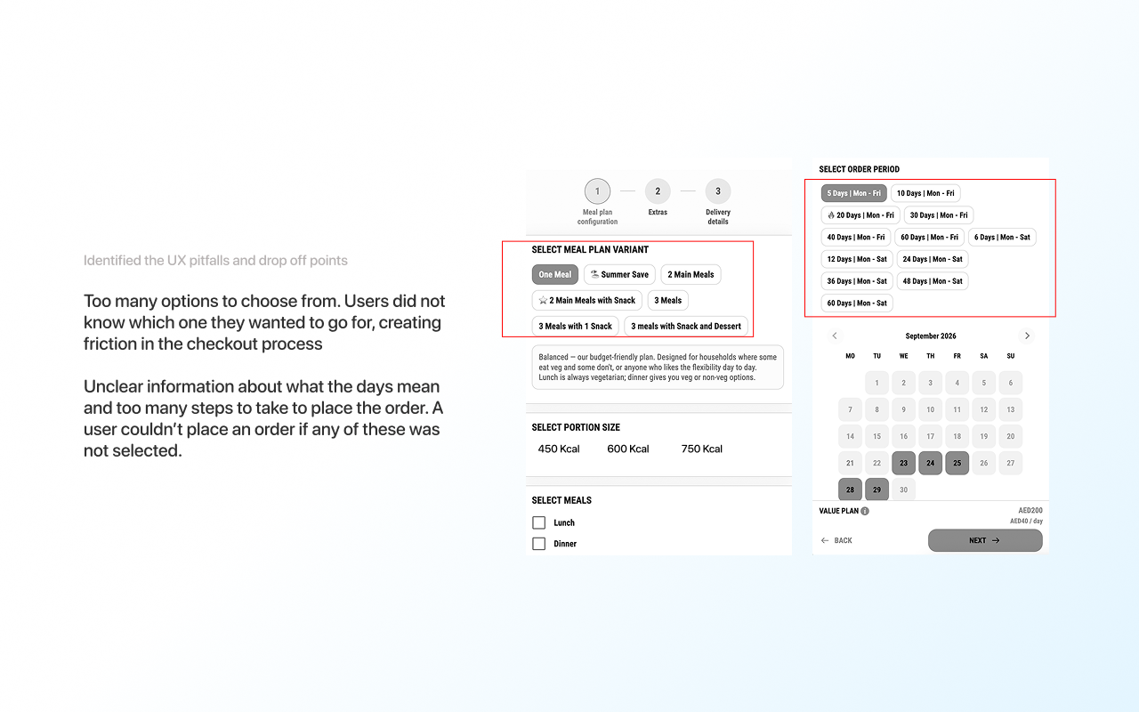
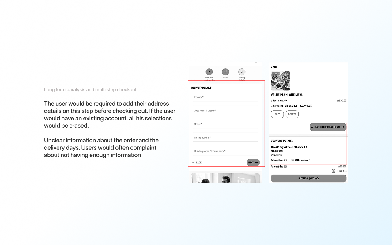
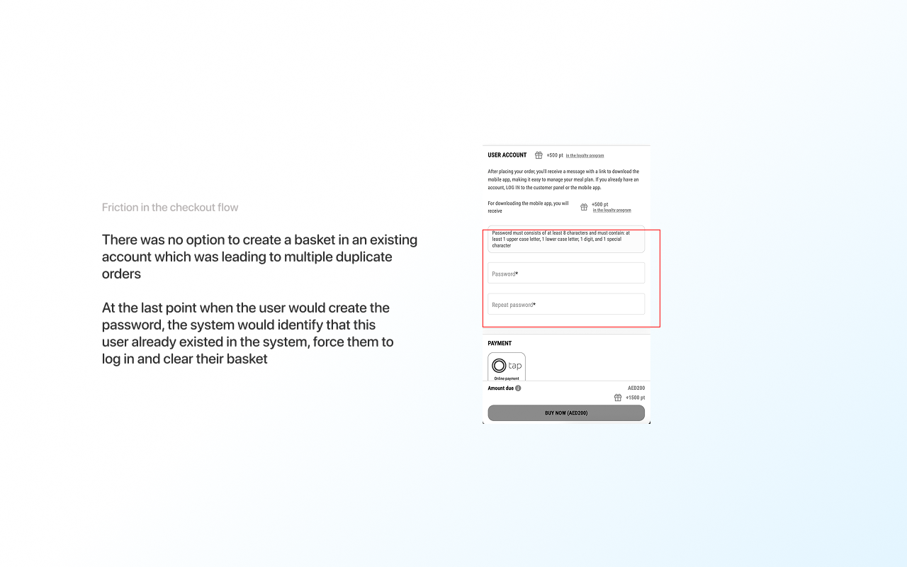
Research and survey results
I ran a competitor analysis and a SWOT review of three direct UAE competitors (Calo, Kcal, and Meals on Me), then studied what actually drives meal plan buyers in this market.
The market research told me what buyers expect, but not how our own customers felt. So I sent a survey about the signup experience and auto-renew, and mapped out the results.
Survey demographic: 92 respondents
Subscriber status
Core features
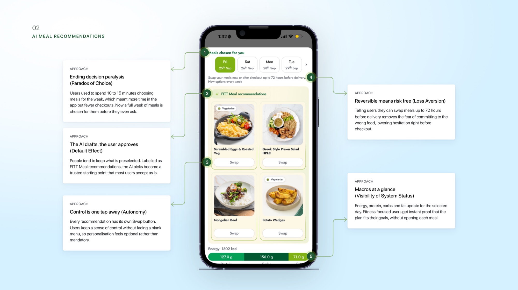
AI meal selection- based on your preferences or what people rate the most popular as, if you are a first time user.
Choose which plan suits you best
Preview the plans to see what options suit your lifestyle, look at the weekly menu, the portion options and jump to a preset selection of customizations tailored for you.
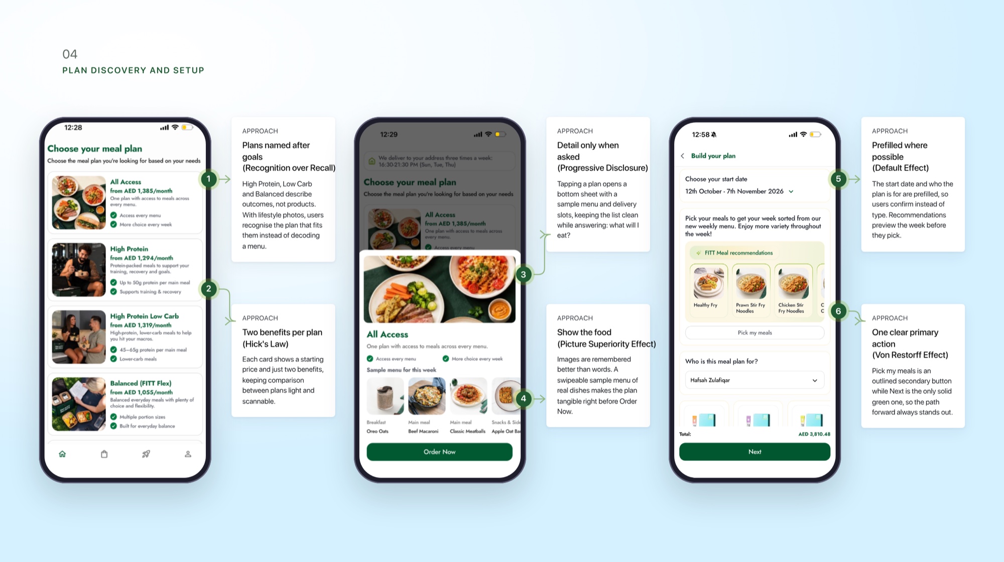
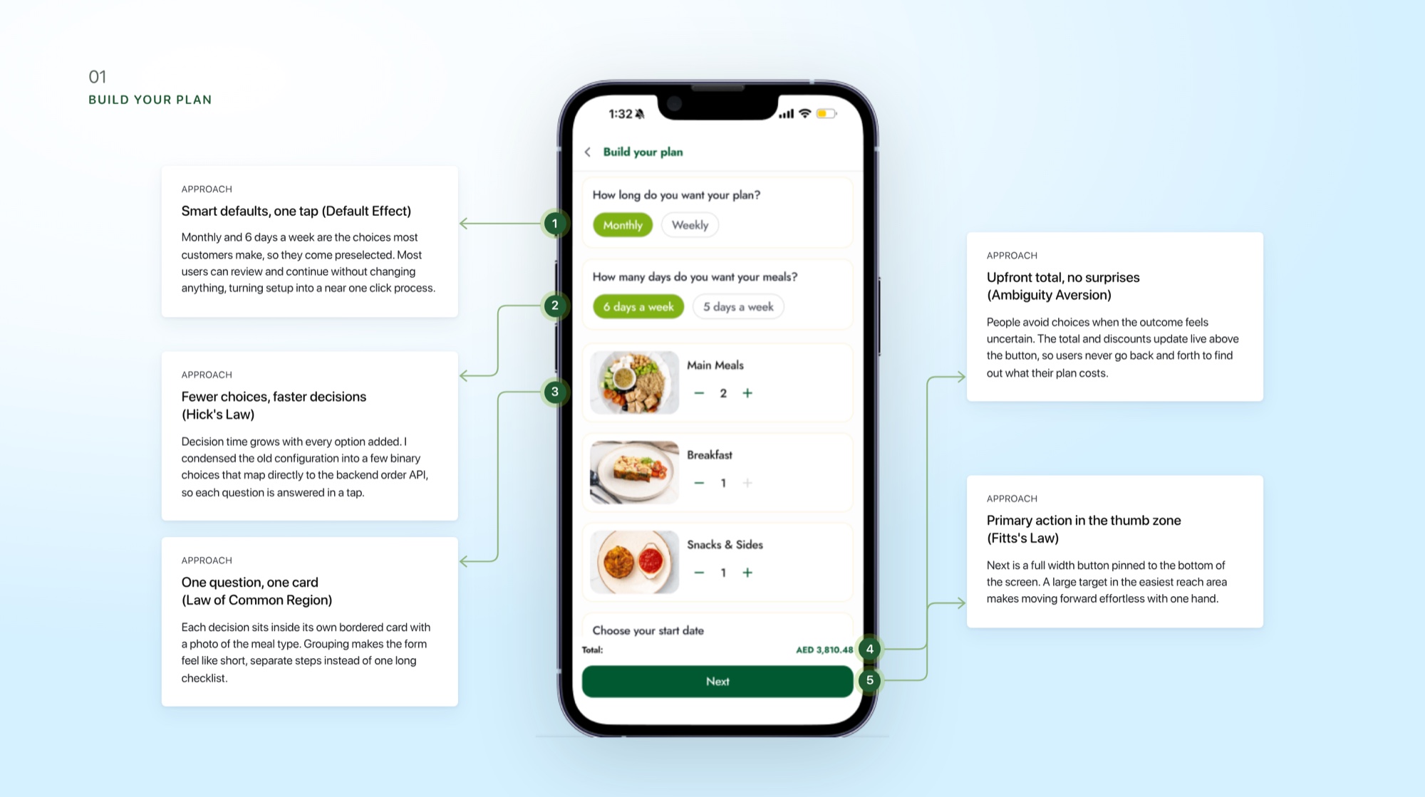
See exactly what you're getting
Fewer choices, smart defaults and one card per question. The total and discounts update live above the button, so the price is clear before payment.
Manage it your way
A week of meals is chosen for you before you ask, with a Swap button on every pick and macros visible at a glance. Swapping is open until 72 hours before delivery.
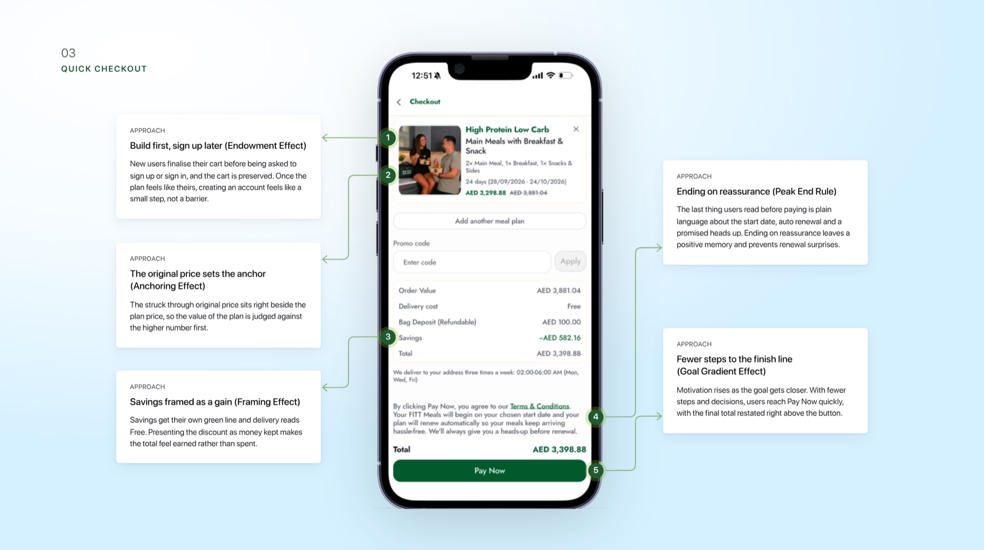
Check out in a few taps
Build first, sign up later. The original price sits beside the plan price, savings are framed as a gain, and the last thing users read before paying is plain-language reassurance.

The biggest drop-off points were unclear pricing, manual customization, and flexibility that needed support. I replaced each one with visible pricing, guided presets, and self-serve controls, and they became FITT Meals' clearest selling points. The numbers after launch:
146%+
Lift in conversion
30%
Growth in YoY revenue
28% → 7%
Bounce rate after launch